24 October 2026 · 7 min read
Social Media for Luxury Resorts: What Makes a Feed Look Genuinely Luxurious
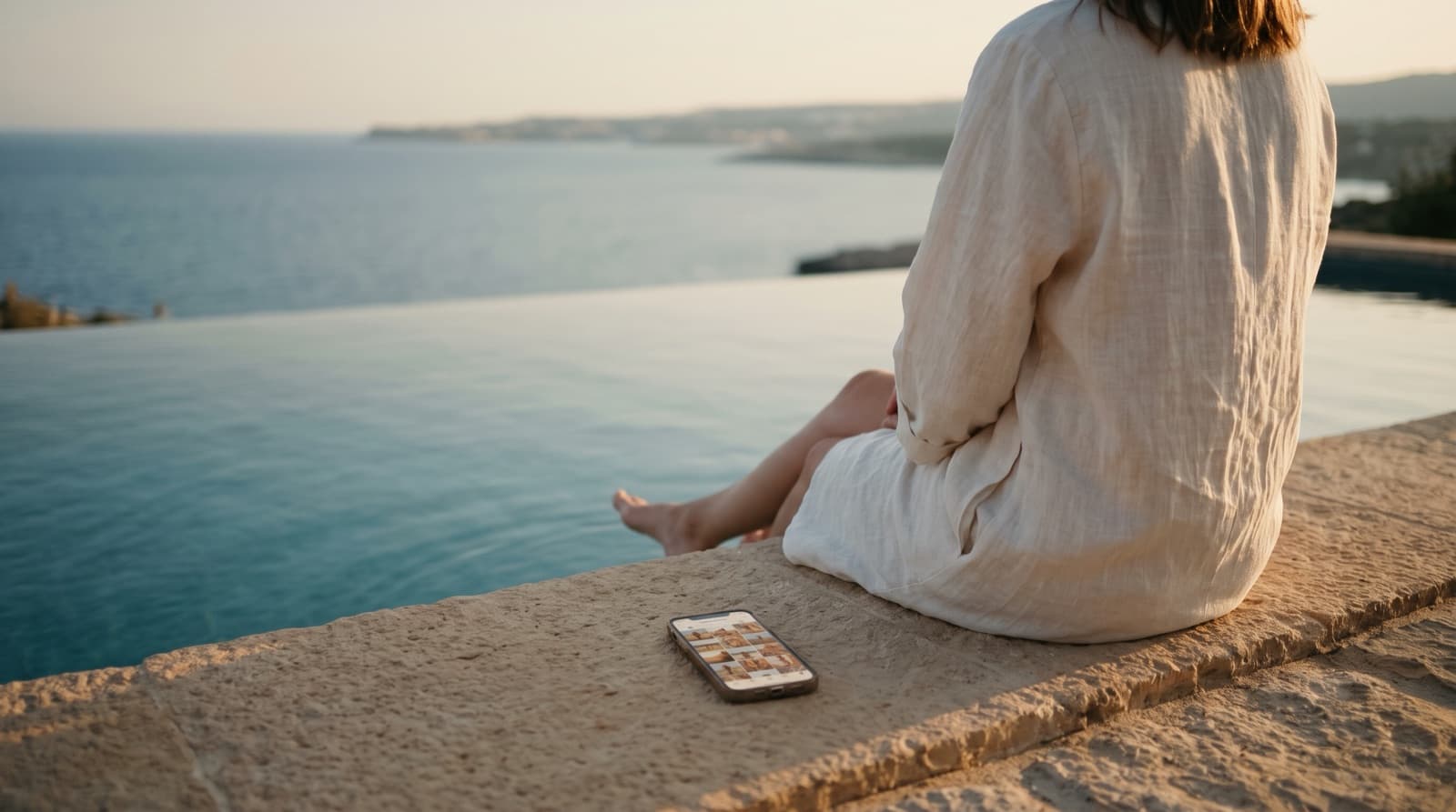
Scroll through enough resort Instagram accounts and a pattern appears. The ones trying hardest to look luxurious — gold filters, empty marble bathrooms, a champagne flute on every third post — are rarely the ones that feel it. The genuinely luxurious feeds tend to be calmer, more consistent and, surprisingly often, full of people.
That gap is almost never about budget. It's about a handful of decisions most resorts make by default rather than by design.
The short version: a luxury resort's feed earns its credibility through consistency and through people, not through objects. Keep the grid disciplined and on-brand, show guests actually enjoying the place, and give guest content a home in Stories and Reels rather than letting it scatter the feed.
This guide goes deeper into the resort section of which social media platforms suit which hotels, focusing on Instagram, where most luxury resort decisions are still made.
Key takeaways
- Consistency is the luxury signal. Not a particular filter or colour, but the same visual language from one post to the next.
- Luxury is an experience, so show people having it. Faces and expressions sell a resort; empty rooms only describe it.
- Guest content is essential, but placement matters. Share it generously in Stories and Reels; keep the grid carrying the brand.
- Highlights are a menu, not an archive. Clear categories with simple, readable covers get noticeably more use than tiny photo thumbnails.
- Post regularly, not constantly. Several times a week, every week, beats bursts followed by silence.
What separates real luxury from "trying to look luxury"
When I look at a resort's Instagram, the first thing I notice isn't any single photo. It's whether the feed holds together.
Consistency over any particular look
There's no special tint or colour that makes a feed luxurious. What matters is that the colours stay consistent with the brand's own palette, and with each other, from post to post. A feed that jumps from cool blue to warm orange to heavily filtered sunset looks like it was assembled by several people with different ideas — because it usually was.
Luxury reads as control. When every image sits in the same visual world, the account feels considered, and guests assume the stay will be too. This is the same principle behind a strong hotel brand identity: quiet restraint, applied consistently, says more than any individual flourish.
People, not only objects
Many luxury resorts lean heavily on product photography: the suite, the infinity pool at dawn, the plated dessert. Those images have their place, but on their own they describe a property rather than sell a stay.
Luxury is the experience, not the items. Some of your content has to show people — their expressions, the moment they relax, a couple laughing over dinner, a child seeing the sea from the balcony. That's what a future guest is actually buying: how it will feel to be there. An empty sunbed tells them what you have. A guest stretched out on it, completely unbothered, tells them what they'll get.
A steady rhythm
A luxury account should post several times a week and keep that rhythm through the year. Irregular bursts — five posts during a campaign, then three weeks of nothing — read as an afterthought. A calm, steady cadence matches the brand: unhurried, reliable, always there.
Where guest content belongs
Guest photos and videos are some of the most persuasive content a resort has. They show how real people feel about the property, in a way no professional shoot can fake. Every luxury resort should be sharing them.
The question isn't whether to use guest content. It's where.
Keep the grid for the brand; give guest content to Stories and Reels. The grid is the permanent face of the account — the first thing a prospective guest scrolls through. Professional, on-brand imagery belongs there, carrying the brand's look consistently down the timeline. Guest content is more spontaneous and varies in quality and style, which makes it perfect for formats designed to feel immediate.
- Stories are ideal for reposting guest moments as they happen.
- Highlights let you keep the best of those Stories permanently, organised by theme, without cluttering the grid.
- Reels suit guest videos and short, real moments that show the energy of the place.
The result is an account that feels both polished and alive: a tidy, consistent grid, with the warmth and proof of real guests one tap away.
The small detail that made a real difference: Highlight covers
Not every improvement has to be a big one. One of the most effective changes I've made for a resort's social presence was something most teams barely think about: the Highlight covers.
Many resorts use tiny cropped photos as covers. At that size they're almost impossible to read — a blur of blue that could be the pool, the sea or the spa — so visitors don't know what each Highlight contains and simply skip them.
The fix was simple:
- Clear segmentation. Organise Highlights into distinct, useful categories — rooms, dining, spa, activities, the destination — rather than an archive of whatever was posted.
- Simple vector icons. A clean icon for each category, readable at a glance, tells visitors instantly what they'll find.
- Brand colours and type. The covers follow the brand palette and typography, so even this small strip of the profile looks like the resort.
Once the Highlights were clearly segmented with readable covers, interaction with them increased noticeably. It's a small piece of design, but Highlights sit right below the bio, in the most valuable space on the profile — and they often work as the resort's quickest brochure.
Putting it together
A luxury resort doesn't need to post more, spend more or follow every trend to look the part online. It needs a few disciplined decisions, applied every week:
- A grid that stays within the brand's visual language.
- Regular content that shows people enjoying the experience, not just the property.
- Guest content shared generously, in the right formats.
- Highlights that work as a clear, branded menu.
All of it depends on the same foundation: a defined visual identity and the design consistency to apply it. Without that, even beautiful photography drifts into a feed that looks like several different hotels. And if the people running the account need rules to follow, a clear brand book is what keeps the feed on-brand when the person who set it up isn't the one posting.
Frequently asked questions
How often should a luxury resort post on Instagram? Several times a week, consistently. A steady rhythm matters more than volume; long gaps followed by bursts of activity make the account feel neglected.
Should luxury resorts share guest photos? Yes — guest content shows how real people feel about the property and is highly persuasive. Share it mainly through Stories, Reels and themed Highlights, and keep the main grid for on-brand imagery so the profile stays consistent.
What makes a hotel Instagram look luxurious? Visual consistency with the brand's own palette, calm and considered imagery, and content that shows people enjoying the experience rather than only empty rooms and objects. Over-filtered images and generic luxury clichés tend to have the opposite effect.
What should Instagram Highlight covers look like for a hotel? Simple, readable icons in the brand's colours, one for each clearly defined category such as rooms, dining, spa and activities. Tiny cropped photos are hard to read at that size, so visitors skip them.
Which platform matters most for luxury resorts? Instagram remains central, with Pinterest and TikTok increasingly important for inspiration and discovery. The full breakdown by hotel type is in which social media platforms suit which hotels.
Looking for a designer for your resort's social media?
I design brand-led social media for hotels and resorts — templates, Highlight systems and visual guidelines your team can actually follow. If your feed doesn't yet look like the stay you offer, get in touch.
Looking for a designer for your hospitality brand?
Elina Imre is a senior graphic designer specialising in brand identity for hotels and resorts, available for part-time and freelance projects.
Get in touch