9 August 2026 · 4 min read
The Hotel Brand Book: What Your Brand Standards Should Actually Include
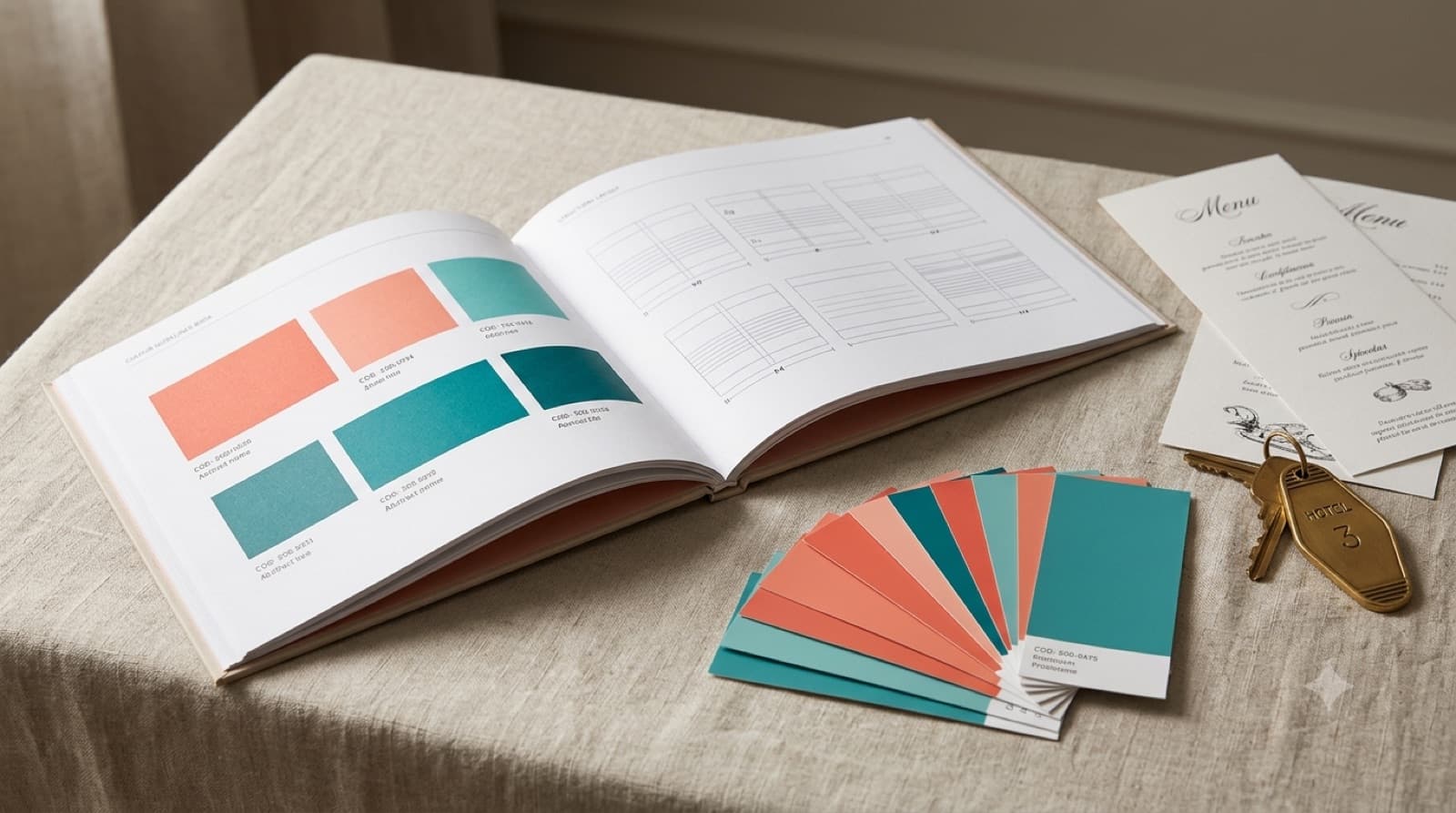
Most hotels have a logo, a colour or two, and a font someone chose years ago. Far fewer have a brand book — the document that says how all of it is actually meant to be used. That gap is where brand consistency quietly falls apart.
The short version: your brand identity is what your hotel looks and sounds like; your brand book is the rulebook that keeps it that way across every hand that touches it. Without the second, the first one drifts.
A brand book is a rulebook, not a logo
People use "brand book," "brand guidelines" and "brand standards" interchangeably, and that's fine — what matters is what the thing does. It takes every decision that went into your hotel brand identity and writes it down precisely enough that someone who wasn't in the room can apply it correctly. Not "use the brand blue" — the exact blue, where it's allowed, and where it isn't.
A logo is an asset. A brand book is the set of rules that stops that asset being stretched, recoloured, crowded and quietly ruined six months later.
Why a hotel needs one more than most businesses
A hotel brand doesn't live in one place. It lives on the website, the OTA listings, the front-desk signage, the restaurant menus, the spa price list, the welcome email, the staff uniforms, the paid ads — and often the work of three different agencies who've never spoken to each other. Every one of those is a chance for the brand to drift.
A brand that looks unprofessional in an obvious way gets fixed quickly. A brand that looks "fine" but is quietly inconsistent across twenty touchpoints erodes trust slowly — and no one can point to why. That is the specific job a brand book does for a hotel: it keeps a brand coherent across many hands and many surfaces, most of which the owner never personally checks.
What a hotel brand book should actually contain
The practical core. A brand book worth having covers, at minimum:
- Logo — the primary mark, its variations (horizontal, stacked, icon-only), minimum sizes, clear space, and an explicit "don't" list: don't stretch, don't recolour, don't drop it on a busy photo.
- Colour — exact values for both worlds: HEX/RGB for screen, CMYK/Pantone for print. A colour that's right on the website and wrong on the printed menu is a common, avoidable failure.
- Typography — the brand fonts, the hierarchy (headline, subhead, body), and web-safe fallbacks for when the brand font can't load.
- Photography and art direction — the most neglected section, and for a hotel the most important. What your images should feel like, what to shoot, what to avoid. This is what stops your Instagram, your website and your brochure looking like three different hotels.
- Voice and tone — how the brand writes: the confirmation email, the menu description, the sign by the pool. And if you host international guests, how that voice survives other languages — a section most brand books forget entirely.
- Applications — worked examples on the surfaces that matter to a hotel: signage, print collateral, social templates, uniforms, in-room printed items.
The test of every section is the same: could someone who has never met you apply it without guessing?
The difference between a brand book that works and one that gathers dust
Most brand books fail for one reason — they describe a feeling instead of specifying a system. "Elegant, warm, timeless" tells a printer nothing. Exact values, exact spacing, exact rules for when a rule may bend — that is what actually gets followed.
A brand book only works if it's specific enough to be enforceable. Vague guidelines are the weak point, not the enforcement. The best ones are also usable: short enough to be read, clear enough to be picked up mid-task by a new marketing hire or an outside agency without a phone call.
Boutique or chain — right-size it
A boutique hotel doesn't need the 120-page brand bible a global group runs on, and trying to produce one usually means it never gets finished. What a smaller property needs is a tight, complete set of standards — logo, colour, type, photography, voice, and a handful of real application examples — that fits how it actually operates.
The goal isn't a thick document; it's a consistent brand. A focused ten pages people actually use beats a hundred that sit in a drawer.
Where to start
If your hotel's branding feels slightly different everywhere it appears, the problem usually isn't the identity — it's the absence of a brand book holding it together. Writing that down is one of the highest-return, least glamorous things a hotel can do for its brand.
A strong identity makes the first impression. A brand book is what keeps every impression after that consistent.
Elina Imre is a senior brand and graphic designer specialising in hotels and hospitality, working across Europe in four languages. If you're putting your hotel's brand standards in order, get in touch — or start with the complete guide to hotel brand identity.
Looking for a designer for your hospitality brand?
Elina Imre is a senior graphic designer specialising in brand identity for hotels and resorts, available for part-time and freelance projects.
Get in touch