24 October 2026 · 8 min read
Hotel Print Design: Why Printed Materials Still Matter in a QR-Code World
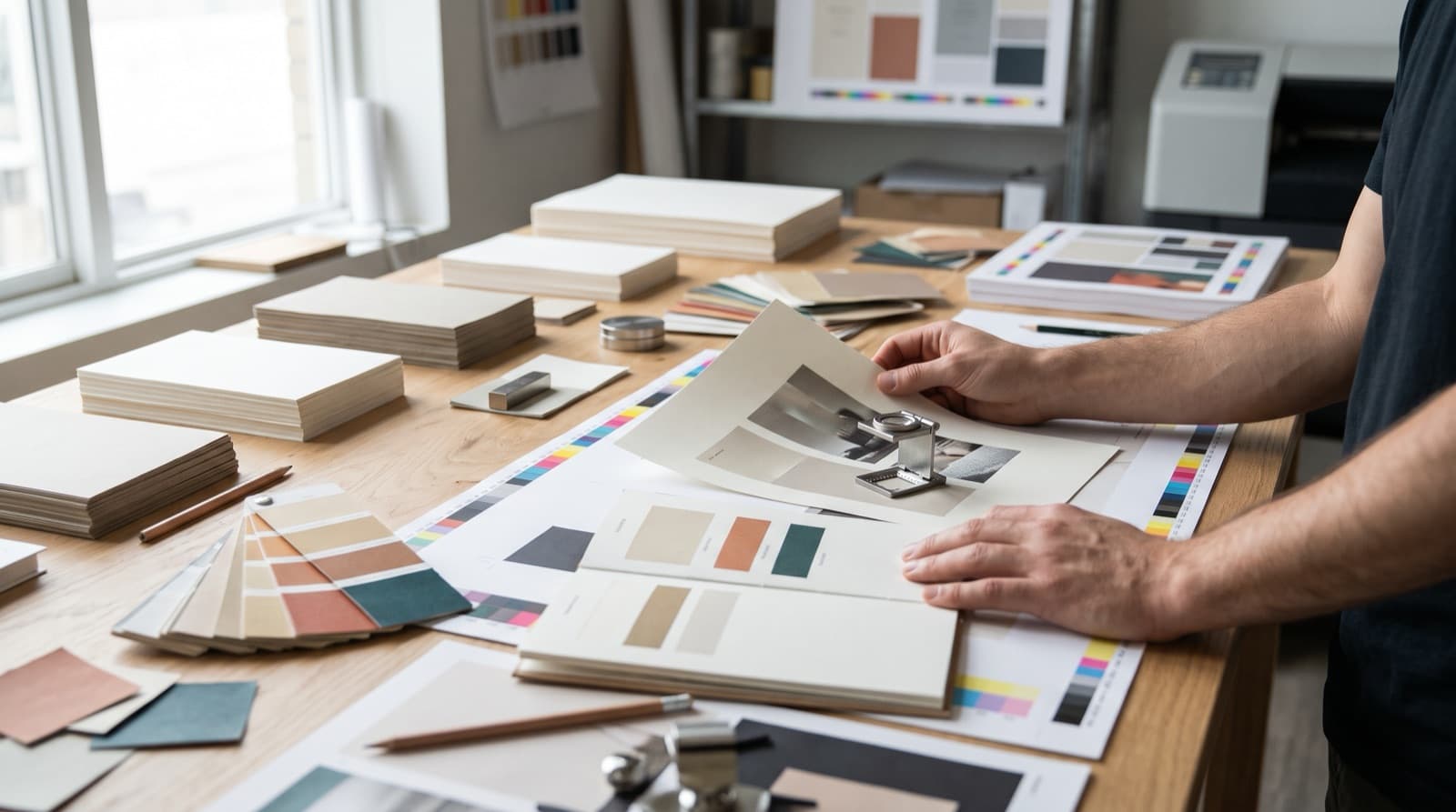
Over the past few years, many hotels have quietly moved their printed materials onto screens. The room directory became a QR code, the restaurant menu became a link, the welcome letter became an email. The motivation is understandable: digital is cheaper to update and cheaper to produce.
But a hotel is not an app. Guests don't experience it through a screen — they walk through it, sit in it, sleep in it, and touch things the whole time they're there.
The short version: printed materials carry more weight in a hotel than in almost any other business, precisely because the stay is physical. The pieces most often underestimated are the small ones guests handle every day, the most common mistake happens not at launch but at the second reprint, and multilingual menus work best when you decide the number of languages first and design the hierarchy around it.
Key takeaways
- A hotel stay is a physical experience. Colour, texture, material and type on printed pieces still shape how guests judge the property.
- QR codes are a supplement, not a replacement. Use them for detail, but don't let them replace the pieces guests actually touch.
- The real quality drop happens at reprint. First batches look great; second and third batches ordered from cheaper printers are where streaks, marks and fading creep in.
- Write your print standards down. Paper, finish, colours and approved suppliers belong in the brand book, so the second order matches the first.
- For multilingual menus, decide the languages first. Then use colour, position or page layout to give each language a clear place.
Why print still matters when everything has a QR code
The push towards digital usually comes from a reasonable place. Management wants to cut printing costs, update information faster and appear modern. QR codes and digital platforms do help with all three.
What gets lost is the nature of the product. When someone stays in a hotel, they touch things. They see things up close, in good light, often for days. That's fundamentally different from using a mobile app — and it means the physical details carry real responsibility for communicating with guests, even in a digital world.
So by all means use QR codes, and point guests to digital platforms for detailed or frequently changing information. But at the end of the day, people are physically in the hotel, and they will physically touch things. The colour, the texture of the material, the fonts and the design of those things all still matter.
The printed pieces hotels underestimate
Rather than single out one item, it's more useful to look at the whole family of small printed pieces that rarely get the attention they deserve:
- Key cards and key card sleeves. Handled by every guest, several times a day, for the entire stay.
- In-room information. Directories, service cards, minibar lists, amenity cards, the notes left on the pillow.
- Information outside the room. Corridor notices, pool and spa rules, lift signs, directional signage.
- Leaflets and flyers. Spa treatments, excursions, restaurant offers.
- Event and feature boards. The small boards announcing tonight's live music, the weekly programme or a new restaurant — indoors and out.
None of these will make or break a stay on its own. Together, they're a large part of what guests actually see and hold — and they're exactly where a brand quietly stays consistent or quietly falls apart. Each one is a touchpoint in the sense Michelin's inspectors use when they judge a hotel's character and sense of place.
The reprint problem: where quality quietly slips
The most common print mistake I see doesn't happen at launch. It happens a year later.
The pattern is almost always the same. The first batch of menus, key card sleeves or directories is produced to a high standard: bright colours, quality paper, a proper finish. It looks exactly like the brand.
Then the stock runs out. Additional orders are placed, and this time someone looks for a cheaper option. When you look for a lower price, you will always find one — a different printing house, lighter paper, a cheaper process. The second or third batch arrives, and within months the problems appear: streaks and long lines across solid colours, marks on the surface, ink that fades after a couple of months of handling and sunlight.
Guests never see the first batch next to the third. They just see a hotel whose materials look tired, and they draw conclusions about everything else.
How to prevent it
The fix is to treat print quality as a standard, not a one-off. Keeping the standard may mean a regular cost rather than a saving, but it's what keeps the brand intact. In practice:
- Document the specification. Paper type and weight, finish (matt, silk, laminated), colour references for print, and sizes for every recurring item — written into the brand book, not stored in one person's memory.
- Keep an approved reference sample. A copy of the first, correct print run gives every future order something concrete to match.
- Name approved suppliers. Switching printers isn't forbidden, but it should be a deliberate decision with a proof check, not a default whenever a cheaper quote arrives.
- Check proofs before every reorder. Colours vary between machines and materials; a quick proof is far cheaper than a full batch of off-brand menus.
Designing menus and guest directories for several languages
For a multilingual hotel, the biggest challenge with a printed menu or guest directory is length. You want to keep it to as few pages as possible, but every additional language multiplies the content. A clean single-language menu can easily become a crowded booklet.
Decide the number of languages first
Before any layout work, decide how many languages the piece genuinely needs. This is a decision to make with management, based on who your guests actually are — not a default of "every language we might ever need." Everything else in the design follows from this number.
If the guest mix allows, two languages is the most manageable option for a printed piece. Additional languages can often live in a digital version linked by a QR code — which is exactly where QR codes earn their place.
Give each language a clear place
With two languages, a few design approaches keep everything in order:
- Colour hierarchy. Set the primary language in the main, bolder brand colour and the second language directly beneath it in a lighter shade of the same colour. The reader's eye finds their language instantly, and the page stays calm.
- Left page, right page. Give each language its own page of a spread, so each reader follows a single continuous column.
- Consistent order. Whichever approach you choose, keep the same order and treatment throughout, so guests learn the system on the first page.
Typography matters here too: if any of your languages use a different alphabet, the fonts must support it properly from the start — one of the reasons multilingual hotel branding is a discipline of its own.
Keep the content minimal — deliberately
The other half of the solution is editorial. It's worth sitting down with management and asking what this menu or directory is really for.
This isn't about withholding information from guests. It's about deciding smartly what belongs on the printed page and what can live elsewhere. Opening hours that change seasonally, long policy text and full spa price lists are often better in a digital version, while the printed piece focuses on what guests need in the moment. Less content means fewer pages, more space, and a more elegant result in every language.
Bringing print into the brand
Printed materials are where a hotel's identity becomes something guests can hold. When they're designed as part of the same system as the website and social media — same colours, same type, same tone — they reinforce everything else the brand is saying. When they're treated as an afterthought, they're often the first place a guest notices that something doesn't quite match.
If you're planning new printed materials, or suspect your current ones have drifted, start with the foundations of your hotel brand identity and make sure print standards are written into the rules everyone follows.
Frequently asked questions
Do hotels still need printed materials if they use QR codes? Yes. A hotel stay is physical — guests touch and see things throughout their stay — so printed pieces still shape their impression of the property. QR codes work best as a supplement for detailed or frequently changing information.
Which printed materials matter most in a hotel? The small, frequently handled pieces: key cards and sleeves, in-room directories and service cards, signage and notices outside rooms, leaflets, and event or feature boards around the property.
Why do hotel menus and printed materials start to look cheap over time? Usually because reorders are placed with cheaper printers or on cheaper materials. The result is streaking, surface marks and fading ink that the original batch didn't have. Documenting print specifications and keeping an approved sample prevents it.
How do you design a menu in several languages? Decide how many languages the printed version really needs first — two is the most manageable. Then give each language a clear place: for example, the primary language in a bold brand colour with the second language beneath it in a lighter shade, or one language per page of a spread.
What should hotel print specifications include? Paper type and weight, finish, colour references for print, sizes for each recurring item, approved suppliers, and a reference sample from a correct print run.
Looking for a print designer for your hotel?
I design hotel print materials — menus, guest directories, key card sleeves, signage and collateral — in English, Turkish, Russian and Ukrainian, with specifications that keep every reprint on-brand. If your printed pieces no longer match the hotel you've built, get in touch.
Looking for a designer for your hospitality brand?
Elina Imre is a senior graphic designer specialising in brand identity for hotels and resorts, available for part-time and freelance projects.
Get in touch