6 September 2026 · 9 min read
Hotel Branding for Russian, Turkish and Ukrainian-Speaking Guests
Most hotels approach this the same way. They translate the website, add a few flags to the language switcher, and wait for the bookings to arrive. When they don't, the conclusion is usually that the market isn't interested.
The market is interested. The brand just didn't speak to it.
The short version: guests from these markets aren't reading your words first — they're reading your finishes, your photography, your payment page and your review profile, and drawing conclusions about your service before they ever reach your booking form. Language is the part everybody fixes. It's rarely the part that lost the booking.
Key takeaways
- "Russian-speaking" is not a nationality. It's a language market spread across a dozen countries and a large European diaspora. Treating it as a single national audience is the first mistake.
- Luxury signals are not universal. Visible richness, service warmth and design pedigree each read as "premium" to different audiences — often in the same hotel, to guests standing in the same lobby.
- Cliché reads as disrespect. Folk-costume stock photography and national ornament signal that you see a stereotype rather than a guest.
- Payment friction is a silent conversion killer. Unfamiliar payment options and unclear currency lose bookings quietly, without a complaint or a review.
- You don't need a rebrand. Keep your core identity fixed and build a modular layer — imagery sets, tone variants, contact blocks — that swaps by market.
First, "Russian-speaking" is not a nationality
This matters more than it sounds, and getting it wrong undermines everything downstream.
Russian is a working travel language for guests from Kazakhstan, Latvia, Estonia, Israel, Georgia, Armenia and a very large diaspora living permanently in Germany, Spain, Cyprus and the UK. Many Ukrainians speak it too, and a great many of them would be actively insulted to have that treated as a statement of identity. Ukrainian and Russian-speaking audiences are distinct, and since 2022 the distinction is not a linguistic footnote — it is the whole point.
If you take one thing from this article: build for language markets, not for flags. A Russian-language booking flow is a service. A Russian flag in your header is a political statement you probably didn't intend to make, and it will cost you Ukrainian bookings.
What actually reads differently
These are patterns, not rules. Individual guests vary enormously and any of them can hold the opposite preference. But over enough properties, the patterns are consistent enough to design around.
Colour and finish carry more weight than style era
The instinct is to argue about modern versus traditional. That's rarely the axis that matters.
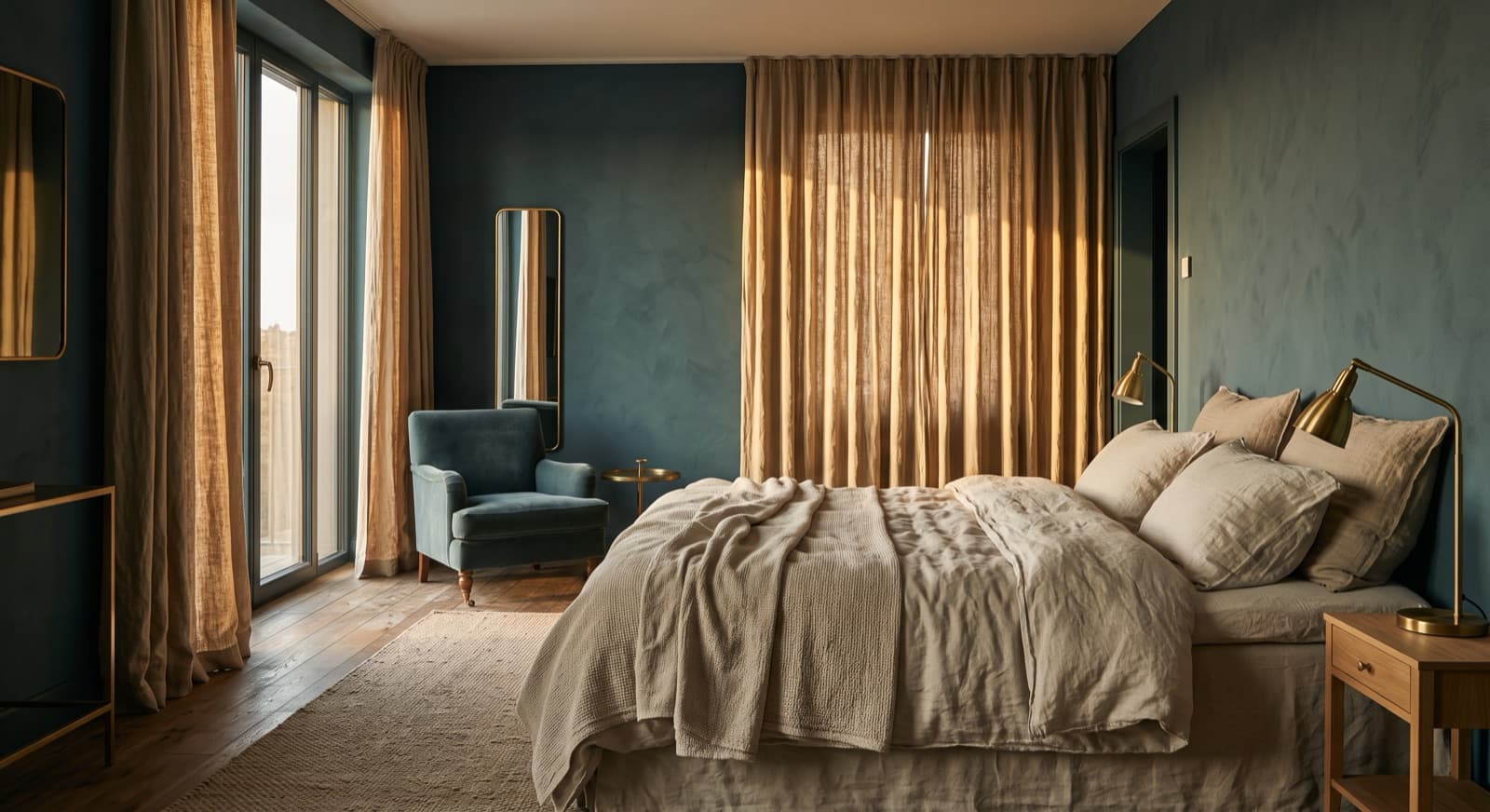
For many Russian-speaking guests, richness of finish reads as premium — deep colours, metallic accents, weight in the drapery and the joinery. A stark Scandinavian white room can read as underwhelming, or frankly as cheap, unless it's carrying real texture to give the eye something to value.
Ukrainian guests often lean modern and clean, but want warm materials that feel lived-in rather than staged. Turkish guests respond strongly to warm, hospitable palettes and textures that suggest comfort and gathering — a room that looks like people are welcome in it, not a room that looks like a photograph of a room.
The same photograph of the same minimal suite can read as "refined" to one guest and "unfinished" to another. That is a photography and art-direction problem long before it's an interiors problem.
Status imagery versus belonging imagery
This is the sharpest single difference, and it's almost entirely a decision about what your hero images show.
Russian-speaking audiences often respond to aspirational imagery — status, exclusivity, the sense of a place that not everyone gets into. Ukrainian and Turkish audiences tend to respond to imagery that shows people: staff, families, food on a table. People signal trust and hospitality; empty rooms signal a transaction.
Western European guests usually sit somewhere else again, favouring curated editorial imagery that emphasises design and experience over both status and warmth.
The practical consequence is that one hero image cannot do all three jobs. It doesn't need to — but you need more than one.
Luxury is not one signal
A chandelier and a marble foyer will read as unambiguous luxury to some Russian-speaking guests.
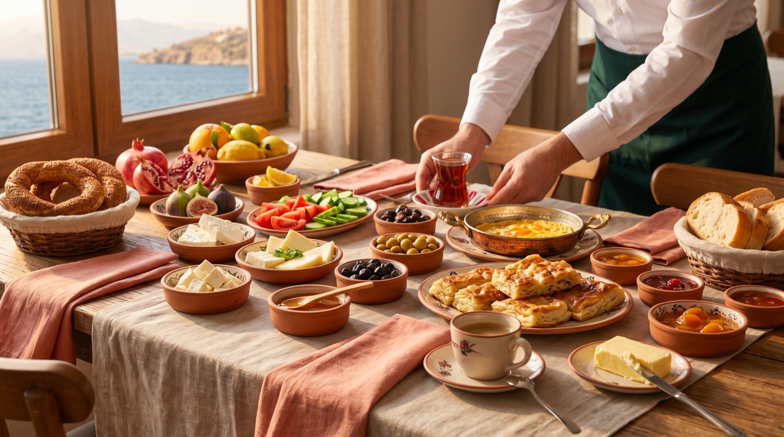
For many Turkish guests, the clearest signal of a generous property is a generous table — visible, abundant food and warm staff interaction. That is the luxury cue, and a hotel that hides its breakfast spread behind a tasteful crop is throwing away its strongest argument to that audience.
Western European guests are increasingly reading a third set of cues entirely: sustainability, design pedigree, a curated point of view.
None of these guests are wrong about what luxury means. They're using different evidence.
The cliché trap
This is where well-intentioned hotels do real damage, and it comes in three reliable forms.
Literal translation with the culture left in English. A property translates its site into Russian and Turkish but leaves the English idioms and Western cultural references sitting in the copy. The result reads as machine-translated, and guests draw the obvious conclusion: if they didn't take the language seriously, they won't take the service seriously either. Good localisation adapts tone, not just words — which is a different discipline from translation and worth understanding properly before you commission either.
Signage decorated with stereotype. Matryoshka dolls to greet Russian speakers. Heavily ornate Ottoman motifs for Turkish guests. The intent is welcome; the effect is patronising, and it cheapens the brand for every other guest walking past it. Nobody wants to be greeted by a costume version of themselves.
Payment options that don't fit. No familiar methods, no clear card-security information, no transparent currency. This one produces no complaint and no review — just an abandoned booking and a market that appears uninterested.
Authenticity beats cliché in every case. A hotel that offers a genuinely fluent Russian booking confirmation and a real human on WhatsApp has done more for that guest than any amount of decorative national ornament.
The trust layer
Comprehension is the first blocker. Perceived risk is the second, and it's the one hotels systematically underestimate.
A booking flow that stays in the guest's language. Not just a translated landing page — the booking widget, the confirmation email, and the pre-arrival message. A booking flow that switches back to English at the payment step undoes the entire impression the landing page created. A local phone number or a WhatsApp contact is a disproportionately strong trust signal for all three of these audiences.
Payment clarity. Show the accepted cards, the security badges and the real total in a currency the guest can reason about. Surprise fees at the final step lose bookings from every market, but they lose them fastest where the guest was already uncertain.
Reviews where the guest actually looks. Russian-speaking travellers commonly check Yandex alongside the international OTAs; Ukrainian and Turkish guests lean on Google, Booking.com and local forums. Your best reviews being invisible on the platform your target guest uses is a positioning problem, not a reputation problem. Responding in the guest's language on those platforms does more work than most paid campaigns.
Photography that shows real service. Staff, the breakfast spread, room detail, visible cleanliness. Staged glamour shots perform worse than honest ones with these audiences, because the question being asked isn't "is this beautiful" — it's "will these people look after me."
A pre-arrival message that removes uncertainty. Arrival logistics, what's been paid, family and dietary options, confirmed in the guest's language before they travel.
How to do this without alienating your existing guests
This is the objection every GM raises, and it's the right objection. A property that redecorates itself around one incoming market usually damages the brand that was already working.
You don't need to. Localise the guest journey, not the identity.
Keep your core brand assets fixed — logo, typography, core palette, the things that make the property recognisably itself across every market. Then build a modular layer that your booking engine and marketing can swap:
- Hero photo sets, cut for status-led and people-led variants
- Tone variants of the core copy, transcreated rather than translated
- Payment badges and accepted-method blocks per market
- Contact blocks carrying the right channel — WhatsApp, phone, email — for each audience
This removes the three real conversion blockers — comprehension, payment friction and perceived risk — without a rebrand. It's also exactly the kind of thing that belongs in a documented brand book, because the whole approach falls apart the moment four different people start improvising market variants without a rule for what's fixed and what's flexible.
If your core identity isn't solid enough to carry variants without dissolving, that's the prior problem — start with the brand identity foundations and come back to market layers afterwards.
Frequently asked questions
How should a German or Greek hotel market to Russian-speaking tourists? Start with the booking journey rather than the advertising. A fully localised booking flow, confirmation and pre-arrival sequence, familiar payment options with transparent pricing, visible reviews on the platforms that audience actually uses, and aspirational hero imagery that leads on status rather than on quiet design. Avoid national symbols and flags entirely — they read as political, not welcoming.
What cultural considerations matter when branding a hotel for Turkish or Eastern European guests? Warmth and evidence of hospitality carry more weight than design restraint. Show people, food and service moments rather than empty styled rooms. Expect warm, textured palettes to outperform stark minimalism, and treat generous visible catering as a luxury signal rather than something to crop out of the frame.
Do I need a separate website for each language market? Almost never. A properly localised language version of your existing site, with market-appropriate imagery and a booking flow that stays in-language to the end, does the job. Separate sites fragment your SEO and multiply the maintenance burden for very little gain.
Is translating the website enough? No, and this is the single most common failure. Translation moves the words; it doesn't adapt tone, cultural reference, imagery or the payment and trust cues that actually convert. A site that's been translated but not localised often reads as less trustworthy than one left in English.
Won't targeting these markets put off my Western European guests? Not if you layer rather than replace. Your Western guests never see the Russian or Turkish variants — they see the identity they already responded to. The risk only appears when hotels bolt market-specific decoration onto the shared, public-facing brand, which is the cliché trap described above.
Adapting a hotel brand across guest markets is largely a question of knowing which parts must never move and which parts should. I work across English, Turkish, Russian and Ukrainian, which means the cultural read and the design decision happen in the same head rather than getting lost between a designer and a translation agency.
If you're trying to reach these guests and suspect your brand is the thing getting in the way, get in touch.
Looking for a designer for your hospitality brand?
Elina Imre is a senior graphic designer specialising in brand identity for hotels and resorts, available for part-time and freelance projects.
Get in touch